Spring 2017 One Room Challenge Living Room Dining Room Reveal
I'm so happy to be able to share my project today! After having a contractor I hired through Home Advisor disappear mid-job, I didn't know if this would happen. It's been quite an adventure. One very well worth the tribulations, though, and I have to thank Linda, from Calling it Home, for including me in her absolutely amazing event. The One Room Challenge is my favorite thing on the internet.
To see my project from the beginning, go here.
The formal areas that are all open to each other at the front of the house are being treated as one space as they are all seen at the same time from each room. Let's start in the dining area.
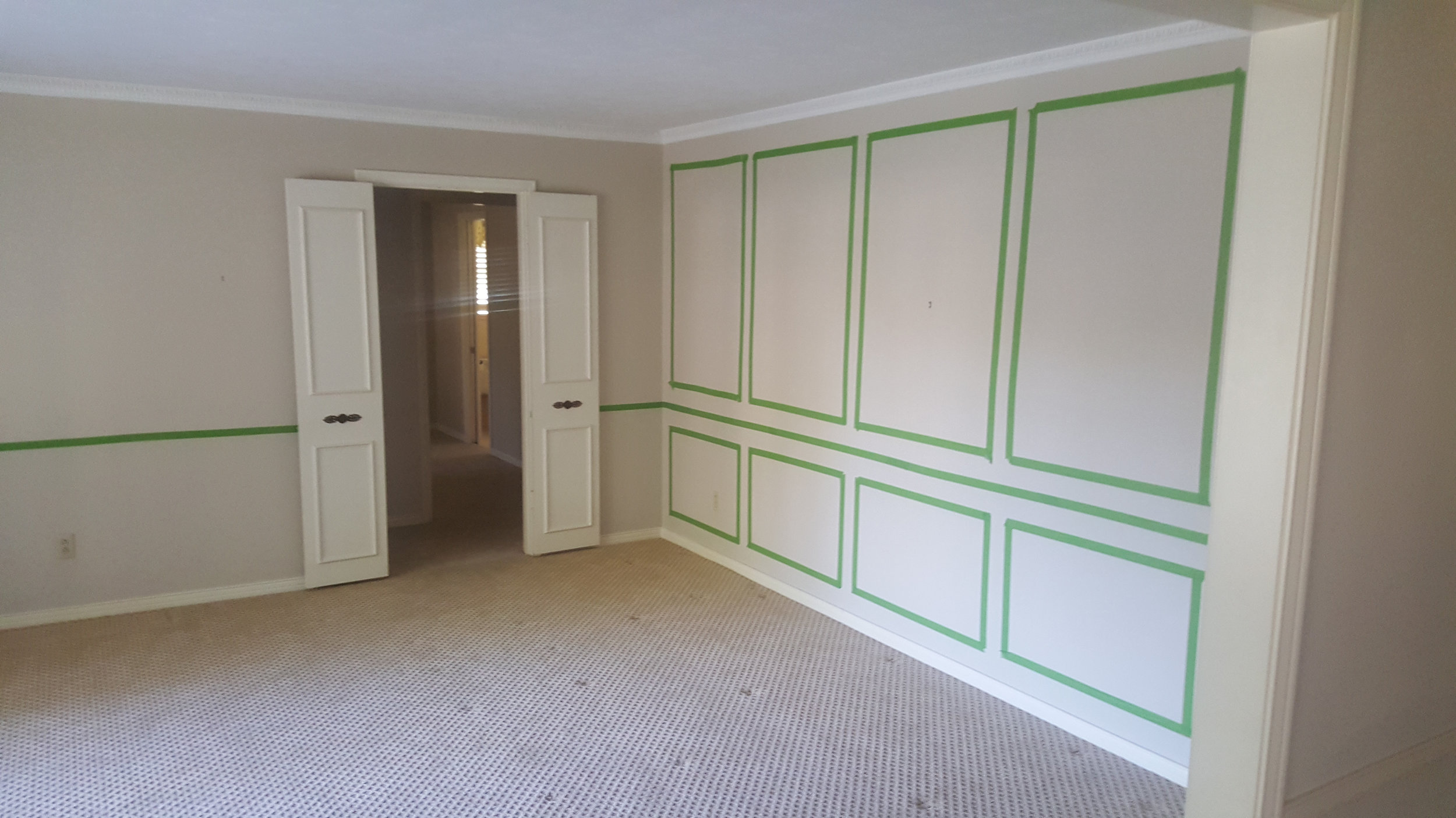
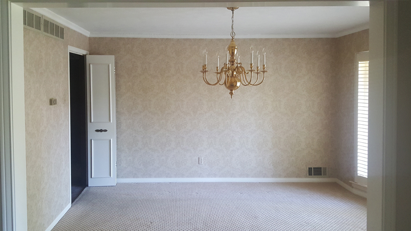
Below is a shot showing tape where my daughter and I were measuring for the Metrie mouldings that would make such an impact on these spaces. This is the original living room in this house, but I'm flipping the rooms because of their size. The original dining room is 11x13. That's perfect for a little sitting room, but is a little snug for my dining furniture. There was a doorway leading to a bedroom area that was walled up, ceilings were raised, and hardwood flooring was installed. Because this project included both extensive renovation and design work, it was a much larger scale undertaking than I'd ever experienced.
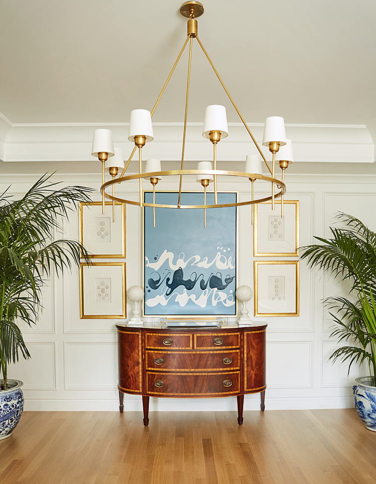
Now, for the fun part -- the after images : ). Here's one wall in my new dining room. The clear and spectacular focal point is the Kaycee Hughes painting in which I'm just enthralled. I've been a huge fan of Kaycee's for a long time, and I'm thrilled to own one of her paintings.
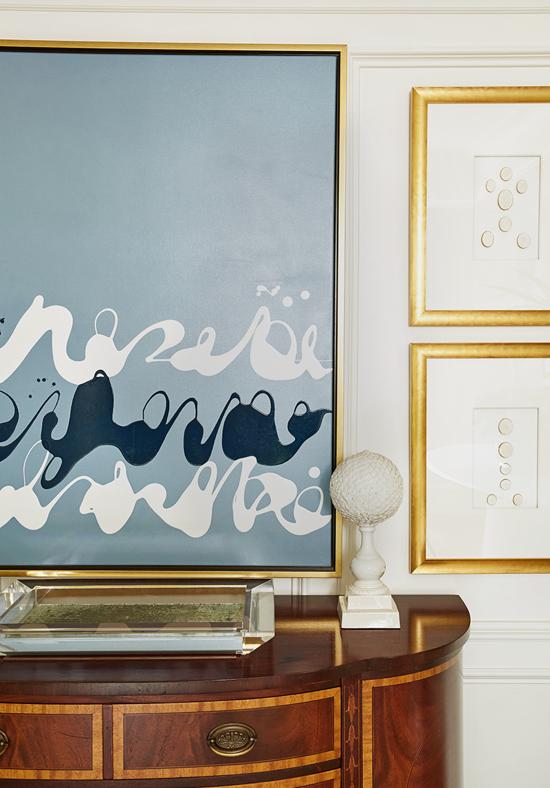
A closer look at the fantastic painting, and the gorgeous framed intaglios from Sally Crawford Studio. These can be found at Sally's not to be missed space at The Mews, in the Dallas Design District area. Actually, I kind of am dying over everything she has in her space right now. If you go take a look, and leave with the black table, just please don't tell me.
Kaycee couldn't have created anything more perfect for my dining room. It's very impactful, and I love having such a statement wall.
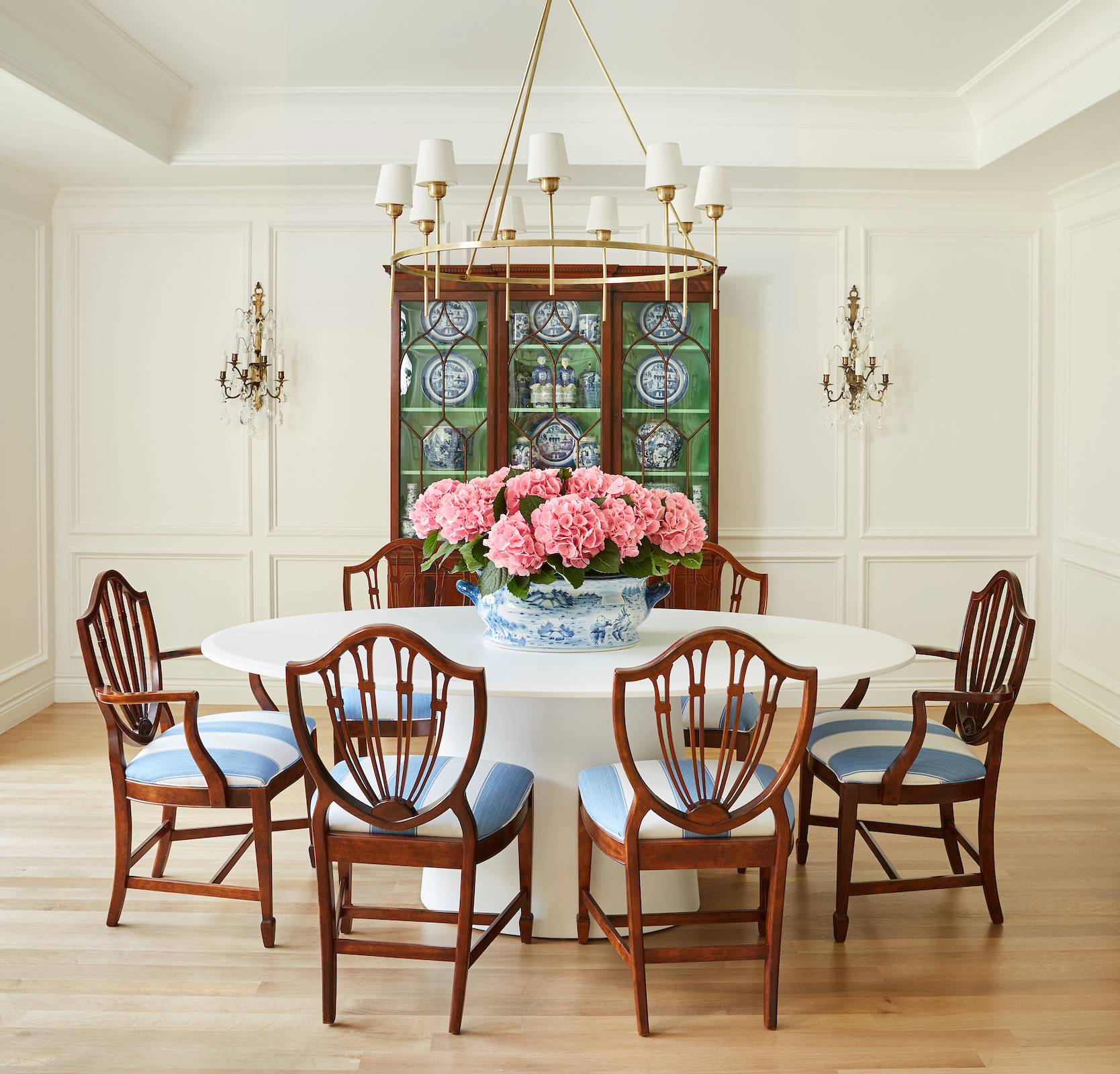
All kinds of new things to share here. My other dining table, a stained mahogany double pedestal table, camouflaged my dining room chairs, and that bothered me. I want to see contrast between them. I've also been intrigued with the idea of mixing in a modern table with my very traditional dining room furniture. This table from Bellacor works toward both of those objectives.
This image is also perfect to point out my new hardwoods. I worked with Jessica, from Allegheny Mountain Hardwood Flooring, and really can't say enough about both the quality of the flooring and how great it was working with Jessica. Her level of knowledge and expertise can't be surpassed, and beyond that, she's incredibly helpful and and instructive. The articles she's written for their site helped me learn everything I needed to know in order to make decisions about flooring. Go here to read more about my hardwoods.
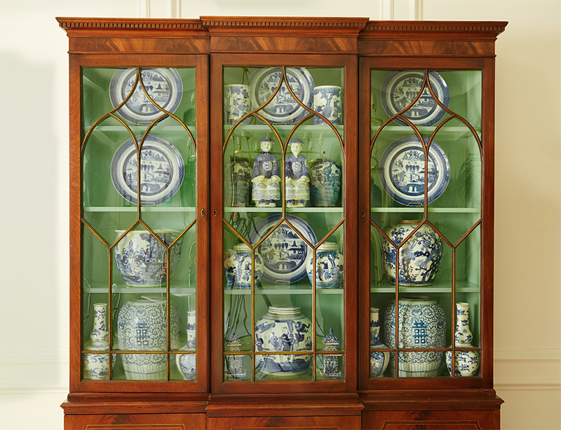
Painting the inside of the china cabinet creates an impactful update. Having a stain in the back can create the appearance of a giant dark rectangle on the wall, and I was very ready for a new look. I found this 1940s-ish Baker cabinet about 18 years ago, and love having the extra storage it provides. The green inside makes a huge difference, and the talented experts Diana and Justin at The CEH made it happen. They did a beautiful job, and working with them was delightful.
Also, new to the room is this fixture. Before, I had a traditional crystal chandelier, and this new table and chandelier are quite a departure. I'm onboard with the table, but am still getting used to the new lighting. To be honest, I'm not sure at this point whether or not it'll stay. I need a store that will allow shoppers to take chandeliers out on approval : ). You can see in this image that we're looking through the dining room and entry and into the sitting room.
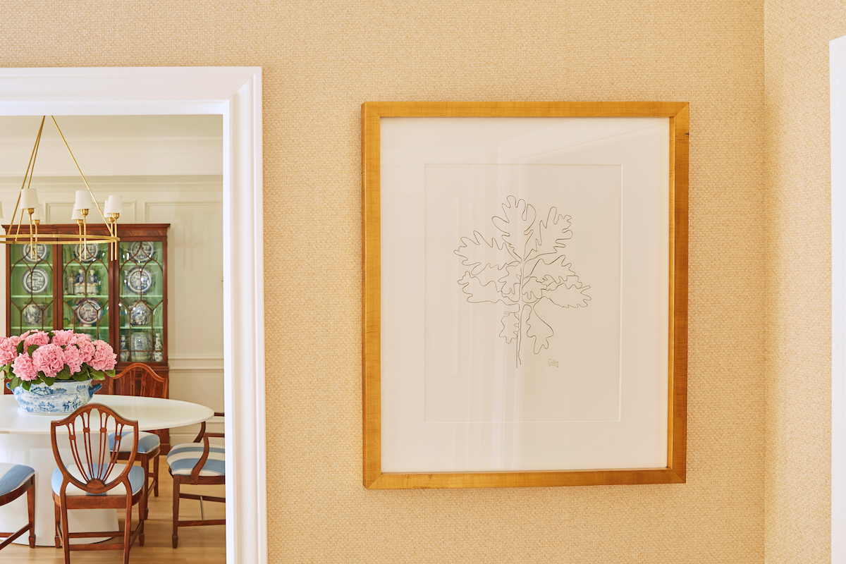
I actually didn't finish everything I had on my list because of the disappearing act pulled by Donald and Sons, the Dallas area contractor I hired through Home Advisor, but I do have two things I love here to share. This paper from Stroheim is fantastic. The texture the woven grass creates is so good. It's also not something I've seen a lot before which I like. The other is this gorgeous artwork by Carling Crawford. She's the daughter of Sally Crawford, the owner of the space I mentioned before where you can find the beautiful intaglios. Also offered there are these seriously stunning pieces by Carling. A grouping of them covering a wall would be wonderful.
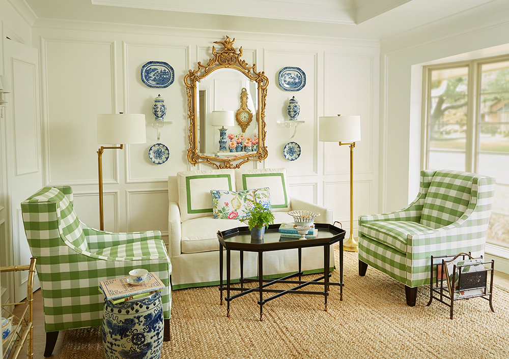
This is my new sitting room, and I'm going to spend lots of time here. Below is a before shot.
The Metrie moulding and Farrow and Ball paint make all the difference. I can hardly believe how significantly these rooms have been transformed. Metrie is just the best, and I'm so happy I decided to do this moulding treatment. Working with them is a pleasure, and their mouldings are of such high quality. I've got the entire house to renovate, and I'll definitely be replicating aspects of this in other parts of the house. Go here to read more about the mouldings and the specific Metrie products used.
As for the paint, I've used All White from Farrow and Ball before, and it's my favorite. It's expensive, and you can easily see why. The quality is amazing. The All White is a lovely shade of white that's pure, but still soft. Read more about the paint here.
I fell in love with Susie Kwiatkowski's hydrangea paintings at Mecox Gardens here in Dallas. They can't keep them on the walls for anytime at all there, and it's easy to see why. I'm so happy to have one to enjoy in my happy little room. She's so talented -- aren't the colors perfect in here?
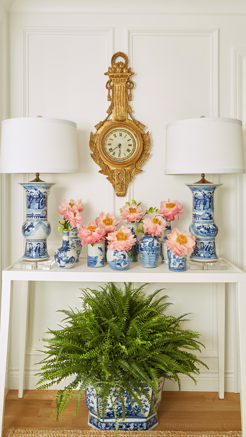
And, don't miss seeing the darling sconces by Crystorama on either side of the painting, or the fabulous brass floor lamps from Lamps Plus. Love the brass with the mirror and white on white is always good.
Did you notice the fun tea cart under Susie's fabulous painting? I'm all set for tea time, and have a perfect little spot for visiting with friends.
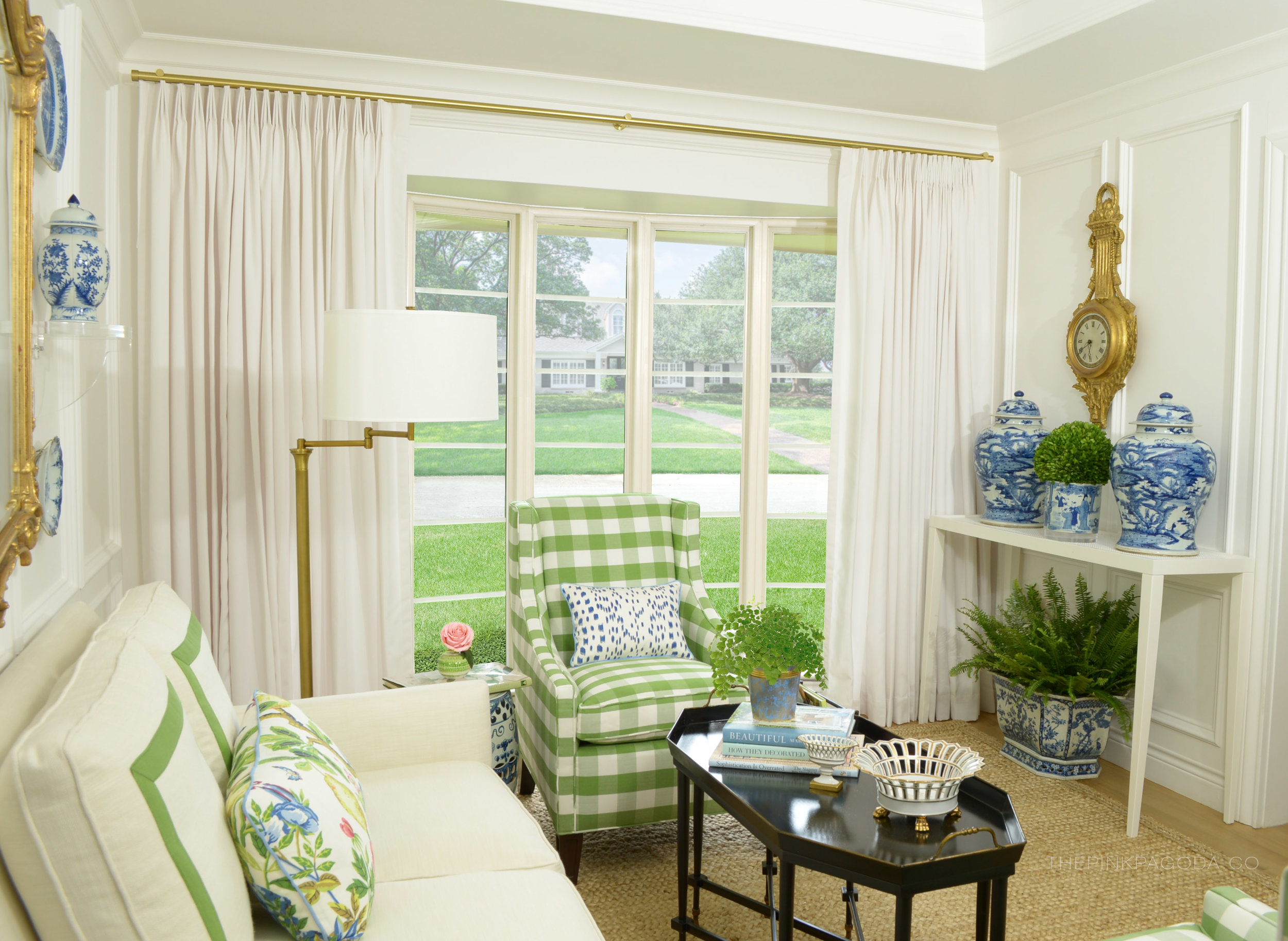
The decision to use green was a last minute one. If you've been following along, you know I'd been planning to use blue and white fabrics. I'm glad I was spontaneous and listened to the inner voice that was saying, "Stop! Use green!" This change created a more fresh and cheerful space. The buffalo check on the chairs is perfect. The shade of green is gorgeous, and the checks are nice and large. Another addition I love is the rug which is to the trade. If you're interested in one, send me an email, and I can point you in the right direction.
The fabric on the loveseat is indoor/outdoor, and I love that I can have such a light color without any worries. I've had this mirror for years, and I love flanking it with blue and white. The acrylic brackets are a great way to update to this classic look.
This spot was perfect for the Oomph Chatham Console Table.
The coffee table is from Hickory Chair, and the style and size couldn't be better for this space.
Care for a mint? A bit of whimsey is always a fun addition anywhere, don't you think? I'm so happy to have a project to share in this incredible event. Things were looking pretty shaky there for awhile having regrettably hired someone untrustworthy, and I lost a good bit of time getting them back on track. There will be some additions, including draperies from The Shade Store, that I'll be adding soon. Please check back to see! For now, go see all the design gorgeousness the other One Room Challenge™ featured designers have to share:
----- Update -----
The gorgeous, amazing drapery from the shade store is up!
Because of my disastrous Home Advisor experience, accurate measurements couldn't be taken in time to have my panels ready for the reveal. There were also a couple of additional situations that further delayed getting these truly gorgeous panels up and photographed, but I'm THRILLED to finally be able to share them.
I shared here about my experience with The Shade Store. After receiving the drapery panels, I'm even more impressed. I can't imagine there's another way to more easily purchase window treatments that are this professionally made. I chose Sunbrella fabric with no embellishments, and they couldn't be more perfect for these two rooms.
Had I not been dealing with remodeling problems, this process would have been very different. Working with The Shade Store is the easiest, most streamlined process for the homeowner that I've seen. You go into a showroom and a highly knowledgable, helpful associate helps you make choices. Their experience makes this super easy and stress-free. They send their measurer to your house to get precise measurements which are sent back to your point person in the showroom. Your point person emails you all the details of your order, and you give the go ahead. Ten days later your window treatments arrive, and installers from The Shade Store come make the installation at your convenience.
My new drapery panels aren't the only additions since the original reveal. I love the little Les Touches pillows on the green buffalo check from Arianna Belle. Her pillows are beautifully made, and ordering from her shop is a breeze. Did you see the darling green vase on the garden stool in the sitting room? It's from Jill Rosenwald, and it's amazing. I wish I could order an entire set of dinnerware just like it.
So now, go see these amazing spaces:
Centsational Girl | Chris Loves Julia | Christine Dovey | Dwell With Dignity
The English Room | Glitter Guide | House of Brinson | House Updated
J+J Design Group | Lark & Linen | Abby Manchesky | Nesting Place
Old Brand New | Old Home Love | The Pink Pagoda | Rambling Renovators
Erica Reitman | Sketch 42 | Suburban B’s | Erin Williamson
Media Partner House Beautiful | TM by CIH
